FALL ‘21 - SAHARA: An Idylic Journey through the Desert

The idea of shooting in a desert first came to me when we were shooting our Yoon collection in the Bonneville Salt Flats in Utah. The local team mentioned Utah’s “Little Sahara,” and the word Sahara stuck with me. Our fall collection was internally called “Earthy,” and I thought, “why not call Earthy—the Sahara collection?” It was perfect, and I became obsessed with finding the perfect desert for the shoot

This is the first place I considered. Approximately 100 miles from Salt Lake City, this desert is filled with sloping sand dunes, but I found the sand a bit too yellow. I dreamed of a desert with much lighter sand, like a pristine white sand beach.
 |
 |
We then considered the LA deserts in Palm Springs and Joshua Tree. These beautiful landscapes are full of plant and rock formations; a lot of texture that could clash with our strong prints.
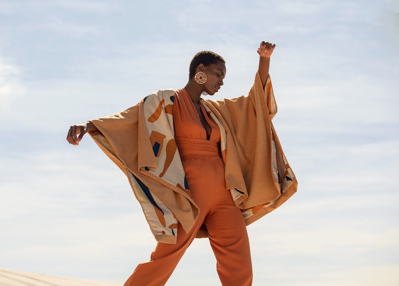
I reached out to Louw Kotze, Diarrablu’s Image Director based in South Africa. I shared with him my vision of a magical bare desert. I dreamt of our beautiful muses dancing on the dunes, and the garments flowing in the wind under a bright blue sky. Louw is a creative genius and he immediately knew what I was looking for. He presented us the mood board for the shoot and I was in love!
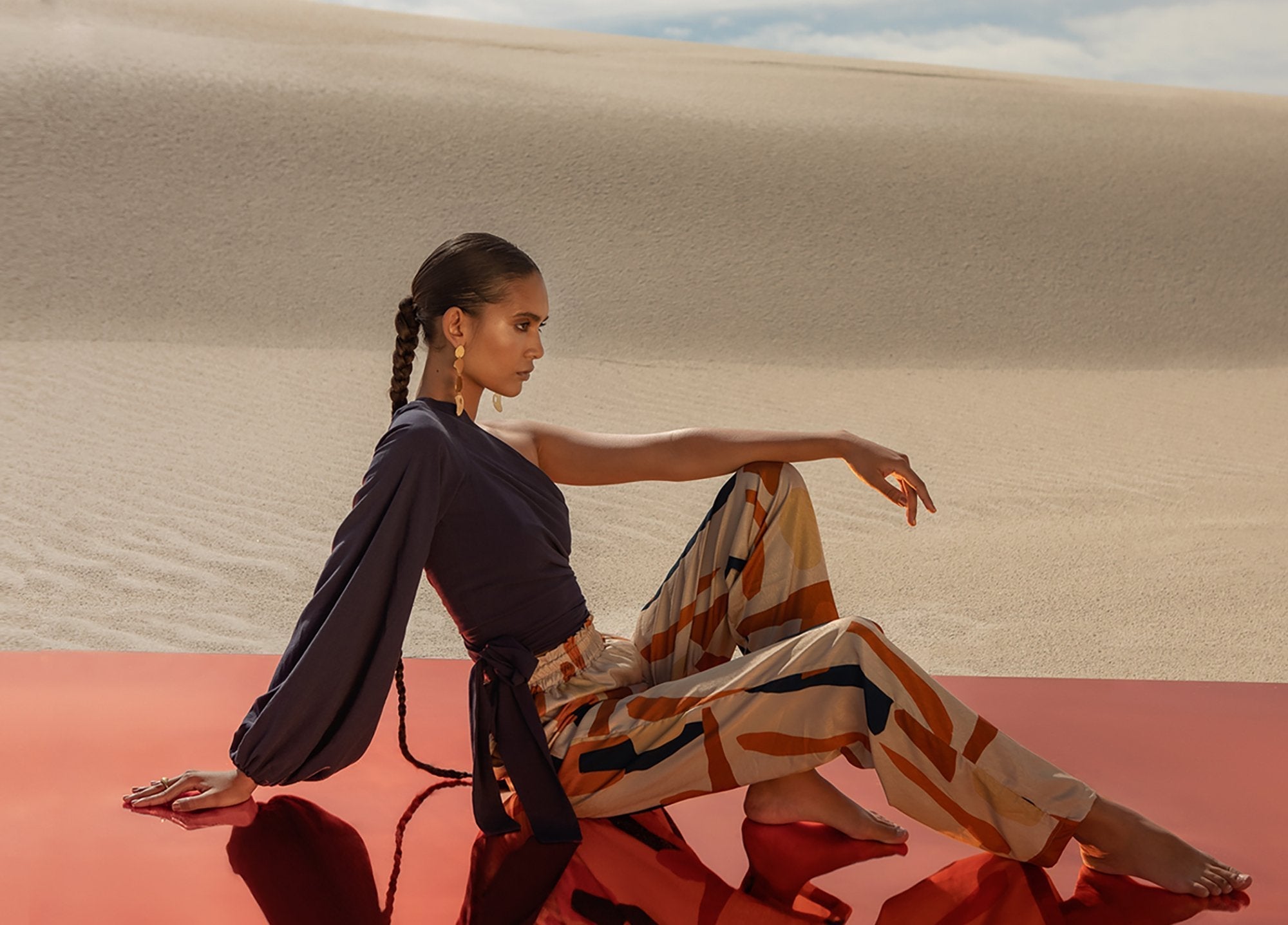
He had this idea of getting colored mirrors to create reflections and instill a sense of freedom in an infinite space. I absolutely loved this idea. Now we just had to find the perfect setting. He shared with us three options:
 |
The first option, Threewaterskloof, is a barren land that’s extremely beautiful in an eerie way. I thought that this place could work for an all-white collection or anything closer to solid colors, but not for Sahara and the strong prints. |
 |
The second option, Kersefontein, is salt flat known for its distinct cracks on the floor. It is a beautiful bare desert, but was missing the dunes I was looking for. |
The third option was the Atlantis Dunes, just 45km from Cape Town, South Africa. It had beautiful light sand, just like I wanted, and it was barren and vast; the perfect canvas for all my beautiful prints. This was it, and I couldn’t have asked for a better desert. We had finally found our Sahara!
I worked with a wonderful team. Louw Kotze was the Creative Director, Chace Geyer helmed production, and Nina Zimolong was behind the lens.
It was challenging. I stayed up from 9 PM to 9 AM California time in order to follow along. The team had no reception in the desert, so we couldn’t coordinate in real time. I was receiving videos every 30 minutes and would share my feedback with voicenotes.
It was winter in South Africa, so the models were really suffering in the cold, but they really pushed through. We photographed the beautiful Summer Zoe Thompson and Faith Johnson and they delivered beyond my expectations.
The best part of the shoot was seeing how the prints came to life in this environment. The Atlantis Dunes were the bare canvas I was looking for to finally present my artwork.
| Tilo is the word in Malinke (West African language) for Sun. It was created from random geometric shapes that I hand-painted in different shades of rust and a hint of navy.This print looked magical on the sand. The background cream color blended in so beautifully with the desert, looking almost transparent. |
| Last Summer with Yonn we launched Costa Blu and it was a huge success so I decided to revisit this print with darker colors for Fall. The orange and mint green geometric shapes painted on a canvas of navy stand out perfectly on the infinite vastness of the desert. |
| The original Suto print was released last Fall in black and became a bestseller so we decided to bring it in a new colorway and Suto Gold was born. It is a vibrant and strong sunshine against the blue sky. |
We worked with Kirsten Goss, who handmakes fine jewelry in Cape Town, and her pieces elevated the looks even further.
Everything about this was a dream; from the journey to the final destination. It reminded me of the importance of staying curious and always exploring. It also embodied the concept of freedom so beautifully. I am so happy I took the time to find my dreamland and so grateful to work with an amazing team that supports my ideas and brings them to life.


